New Humble Mechanic Logo
Well, the much awaited logo is ready. I have been playing around with the colors to see what I like best. If you guys have any input, please post it in the comments, I would love your feed back. With the release of the new logo, I will be working with a buddy of mine to fine tune the site.
Here is the first run of color testing. I am still working on the over all look.
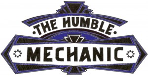 What do you guys think?? Oh, Check out Christy’s tattoo work. She also does all of my tattoos as well. She is ridiculous good








Well you know I am all about purple. I like the gears.
as a graphic designer, I gotta say that it should be kept all one color. the style used comes from a time where 1-2 colors were the normal, and they usually weren’t put together. one was a background field and accent color, while the other was the line art and detail color. look at old appliance and repair part boxes from the 30-40s. that’s the feel I get from the style, I’d follow suit with the coloring. I dig the art deco style and composition though, big time. nicely done.
I agree with jeremy a bit. The purple/blue color is too dark. It hides the details and line work. Maybe go with something a bit lighter and make it pop. Otherwise the logo looks badass i also dig the layout
Thanks for the feed back guys! I am not set on the colors right now. My buddy is cleaning it up so it looks better online. I have not seen what he has in mind for the design of the site. I am pretty excited.